Redesign of Google Search results
- On 27/05/2019
- Google, redesign, search results
Google will soon present a redesign of the search results!
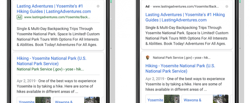
Just above the result cards will appear the website name and its favicon.
“With this new design, a website’s branding can be front and center, helping you better understand where the information is coming from and what pages have what you’re looking for.”
The new look will be more helpful to searchers as they can faster and more easily scan the page of results and decide which source to choose.
This upcoming change will also affect how ads are displayed. A bold black ‘Ad’ label will replace the current one, along with a URL.
The ad’s text will now be positioned below the Ad label, which will better distinguish the paid results from the organic ones.
This transformation of the search results is mindfully designed for the future, Google says:
“As we continue to make new content formats and useful actions available—from buying movie tickets to playing podcasts—this new design allows us to add more action buttons and helpful previews to search results cards, all while giving you a better sense of the web page’s content with clear attribution back to the source.”
This redesign is coming first to mobile and will be rolling out over the next few days.


